The Artothek in Munich stands as a cultural bastion, intertwining aesthetics and accessibility through its emblematic logo. This logo embodies not merely visual appeal but serves as a profound representation of the institution’s underlying philosophy. The deliberate choices in its design prompt a deeper contemplation on the role of art in society, serving as a narrative that transcends the simple portrayal of visual identity.
At its essence, the term “Artothek” amalgamates the concepts of ‘art’ and ‘library,’ reflecting the organization’s core mission: to democratize access to art. In an era characterized by economic disparities and exclusivity in the cultural domain, the Artothek endeavors to dismantle these barriers. The company’s identity resonates deeply with the philosophy of inclusivity, aiming to provide Munich’s denizens with the opportunity to engage with art—not merely as spectators but as active participants. Art is meant to be experienced, and the Artothek facilitates this by allowing the public to borrow artworks as they would books, fostering a dynamic relationship between the art, the artist, and the audience.
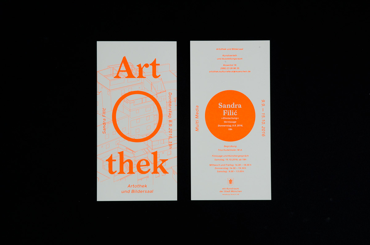
The design of the logo itself is an intricate tapestry of thought, carefully curated to encapsulate the Artothek’s mission. Employing a minimalist approach, the logo artfully combines geometric shapes and a harmonious color palette. The choice of circular forms symbolizes unity and community, subtly hinting at the collaborative spirit of the institution. Meanwhile, the typographic elements reflect contemporary styles while paying homage to traditional art forms, thus creating a timeless appeal. This careful balance of old and new encapsulates the philosophy of transcending artistic barriers, promoting a dialogue between various art movements.
As for the business type, the Artothek operates as a non-profit organization, which underscores its commitment to public service. It is not merely a repository of art; it serves as a community hub that fosters dialogue and engagement through workshops, exhibitions, and creative events. This configuration allows for a unique intersection of business acumen and artistic integrity, cultivating an environment that prioritizes cultural enrichment over profit margins. The absence of a profit-driven motive further emphasizes the organization’s dedication to serving a broader social purpose.
The design company responsible for the Artothek’s branding, although perhaps lesser-known in the global context, has carved a niche through its dedication to conceptual depth in design. They possess a keen understanding of the significance of visual storytelling, crafting designs that resonate with the audience on multiple levels. Their work not only aligns with the Artothek’s mission but also enhances it, creating visual cues that echo the institution’s values. This partnership illustrates the symbiotic relationship between design and philosophy, revealing how robust branding can elevate an organization’s mission beyond the visual into the experiential realm.
Established in [insert year], the Artothek has evolved into a vital cultural enterprise within Munich. Its inception was guided by the notion that art should be an integral part of the urban experience, an idea that continues to inspire its operations today. The institution has grown in both its offerings and infrastructure, adapting to the shifting paradigms of the art world while remaining steadfast in its commitment to accessibility.
In summary, the Artothek logo is not merely a graphic element; rather, it encapsulates a rich philosophy and a commitment to inclusivity within art. From its thoughtful design to its non-profit model and community-focused initiatives, every facet of the Artothek serves as a testament to the transformative power of art and its intrinsic value to society. The organization continues to challenge conventional norms, inviting all to partake in the creative dialogue that art fosters, thereby cementing its status as a pivotal cultural institution in Munich.