The Arbeitsgemeinschaft Kultureller Institutionen, or AKI, stands as a profound exemplar in the realm of cultural collectives. Established in the late 1950s, this entity has not only contributed to the cultural fabric of its environment but has also continually inspired designers through its distinctive emblematic logo. This logo encapsulates an assortment of meanings, philosophies, and signifiers that transcend mere aesthetics.
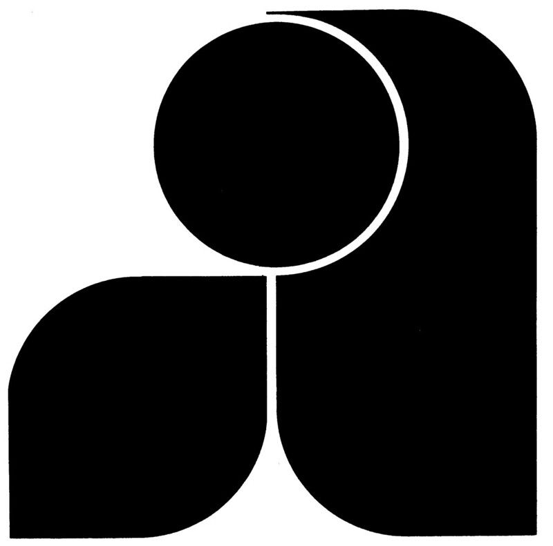
At its core, the logo of AKI is emblematic of unity and collaboration within the cultural sector. The name itself translates to “Working Group of Cultural Institutions,” emphasizing the ideation of synergy among diverse cultural entities. The juxtaposition of various artistic disciplines is echoed in the logo’s design, which employs a blend of geometric forms that interconnect, thus representing the intricate relationships between different cultural institutions. This notion of interconnectedness speaks to a larger narrative about the importance of cooperative efforts in enriching cultural life.
Delving deeper, the visual elements within the logo convey philosophies reflective of the era in which it was crafted. The mid-20th century marked a time of considerable social transformation in Germany. Following the tumultuous aftermath of World War II, there was a collective yearning for renewal, which is poignantly captured in AKI’s design. The choice of colors and shapes resonates with the spectrum of emotions prevalent within society—a subtle nod to the pursuit of hope and rejuvenation. The strategic use of color palettes not only celebrates vibrancy but also suggests an optimistic outlook for cultural collaboration.
In terms of business type, AKI is distinctly characterized as a non-profit organization. Its focus on fostering and promoting cultural institutions underscores its commitment to societal enrichment rather than profit maximization. This distinction is crucial, particularly in an era where commercialism often overshadows the arts. The logo, therefore, is more than just a brand identifier; it is a manifesto of its foundational principles, advocating for the power of the arts to transform lives.
The design of the AKI logo is credited to Walter Breker, a notable German designer whose works often reflect a nuanced understanding of cultural dynamics. Breker’s expertise was not simply in graphic design; his ability to distill complex ideas into visual forms enabled him to create an icon that would endure the test of time. His design philosophy was inherently rooted in minimalism, advocating for simplicity that speaks volumes. This philosophy resonates through the AKI logo, as its clear forms and restrained complexity serve to communicate the organization’s mission effectively.
The year 1960 marked the formalization of the AKI, a pivotal moment that allowed various cultural institutions to band together for shared objectives. This timing is significant, encapsulating a period in which Germany was fervently rebuilding its cultural identity. Consequently, the logo emerged not merely as an organizational emblem but as a beacon of this renewed cultural consciousness. Its longevity can be attributed to this historical significance; through its design, it preserves a narrative of resilience and collaboration that remains relevant today.
In conclusion, the Arbeitsgemeinschaft Kultureller Institutionen logo transcends its role as a mere graphic representation of an organization. It serves as a symbolic articulation of collaboration within the cultural sector, reflective of a historical context rife with change and renewal. Its design continues to provoke fascination, compelling observers to consider the deeper implications of unity, resilience, and the enduring power of cultural institutions. It stands as an art piece in its own right—an icon that inspires both reverence and aspiration within the design community and beyond.