The Aluminium Company of America, often referred to as Alcoa, boasts a logo that elegantly encapsulates its rich heritage and commitment to innovation. A deep dive into the meaning and philosophy behind this iconic emblem reveals much about the company’s identity and operational ethos.
First, let’s ponder a playful question: What does a logo really say about a company? Is it merely a pretty picture, or does it encapsulate the very essence of what a business stands for? In the case of Alcoa, the design is an intentional artifact, laden with symbolism that reflects its aspirations and core values.
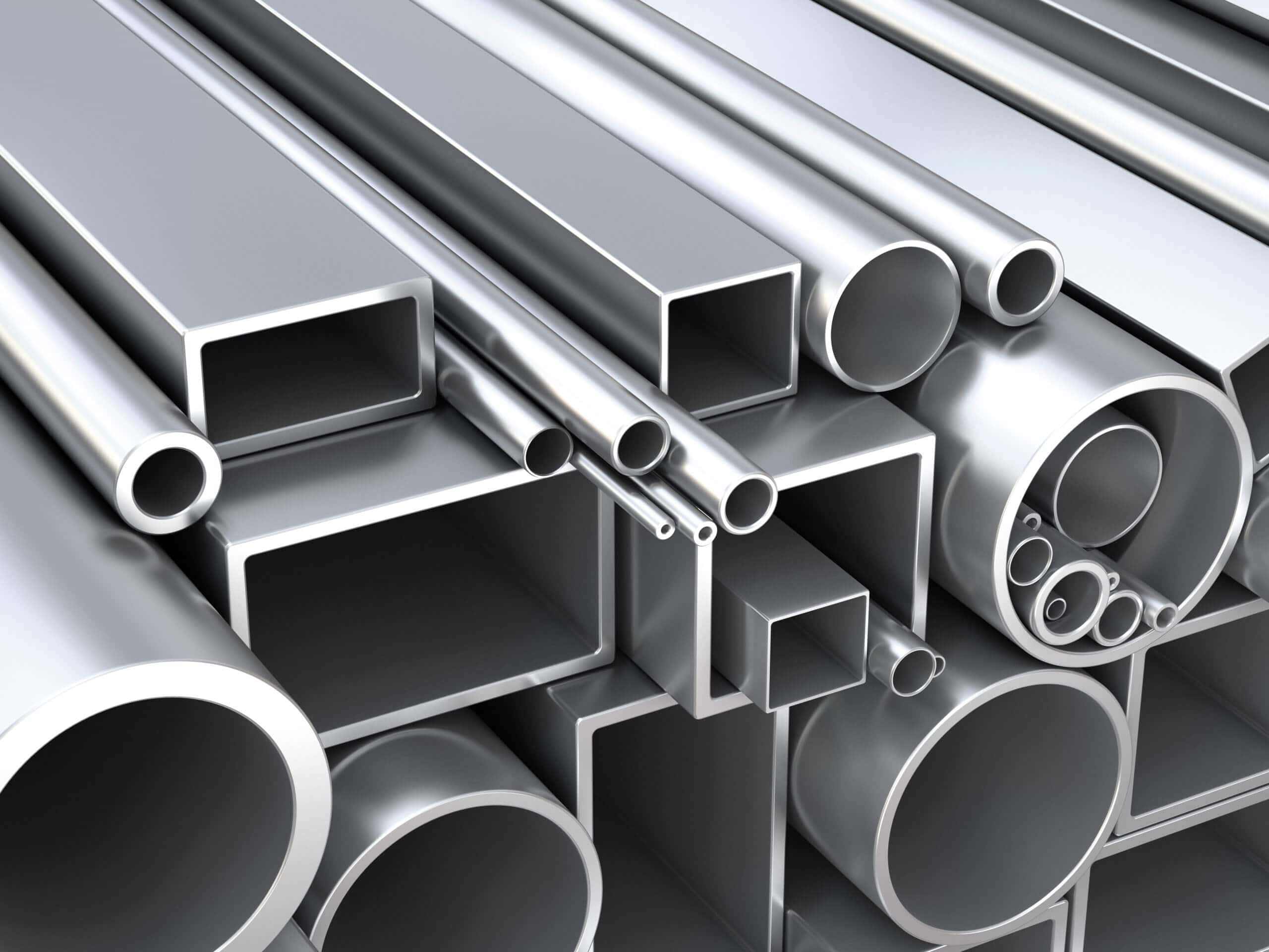
Founded in 1888, Alcoa emerged as a major player in the aluminium industry and spearheaded innovations that propelled the material into mainstream applications. The design philosophy of the logo transcends mere aesthetics; it embodies resilience, versatility, and sustainability—key characteristics of aluminium itself. The sleek lines and geometric forms of the logo are reminiscent of the craftsmanship and technological prowess that Alcoa applies to its products.
Have you ever noticed how logos can evolve over time? Alcoa’s logo has undergone transformations, adapting to modern aesthetics while retaining its foundational symbolism. Each iteration has sought to reflect the changing landscape of the aluminium industry and the company’s steadfast commitment to environmental stewardship. This philosophy of continuous growth and adaptation is not just visual but inherently tied to Alcoa’s business model.
As a leader in the aluminium sector, Alcoa operates primarily as a manufacturing company that specializes in producing aluminium, as well as providing related consulting and development services. They are recognized for their role in sustainable aluminium production, striving for improvements in energy efficiency and reducing carbon footprints across their operations. The interplay of industrial grit and ecological mindfulness offers an intriguing challenge: How can an industrial giant maintain profitability while championing environmental responsibility? Alcoa’s logo serves as a constant reminder of this challenge, portraying an identity that seeks balance between industry prowess and ecological concern.
The design of the Alcoa logo encapsulates a modern sensibility while harking back to the foundational elements of its brand essence. The use of bold colors, especially hues of blue and silver, evokes associations with trust, integrity, and technological advancement. Blue is often synonymous with depth and stability, while silver highlights innovation and high quality, paramount traits that Alcoa aims to communicate to stakeholders.
Moreover, Alcoa’s commitment to research and development is reflected in the dynamic nature of its logo. As the company evolves, so too does its branding—embracing new technologies, processes, and sustainable practices that ensure its leadership status in the market. This logos’ duality speaks volumes: it reflects the timelessness of aluminium—an age-old material—that still captivates the imagination of designers and engineers alike today.
In conclusion, the Alcoa logo is not simply an emblem; it is a narrative woven through the threads of history, innovation, and sustainability. It poses a challenge for the company to continue thriving in a competitive landscape while remaining true to its heritage and ecological philosophy. So next time you glance at the emblem of the Aluminium Company of America, consider the wealth of meaning captured in its design. How might that influence the way you perceive industrial branding in today’s context?