In the realm of culinary enhancement, the Ajinomoto logo stands as a beacon of flavor and quality. This emblematic symbol, synonymous with umami seasoning, encapsulates the ethos and philosophy of a brand that has become a household name across the globe. Understanding the layered meanings behind the Ajinomoto logo and its corporate identity reveals the intricacies of a company dedicated to enhancing culinary experiences through innovative products.
The heart of the Ajinomoto logo lies in its design, which cleverly conveys the brand’s focus on food and flavor. Typically featuring a stylized representation of the company’s name, the logo integrates elements that reflect the essence of taste and seasoning. The vibrant hues often utilized evoke a sense of warmth and freshness, paralleling the inviting nature of the flavors it promotes. The simplicity of the design coupled with its memorable shape fosters immediate recognition, a crucial element in today’s saturated market.
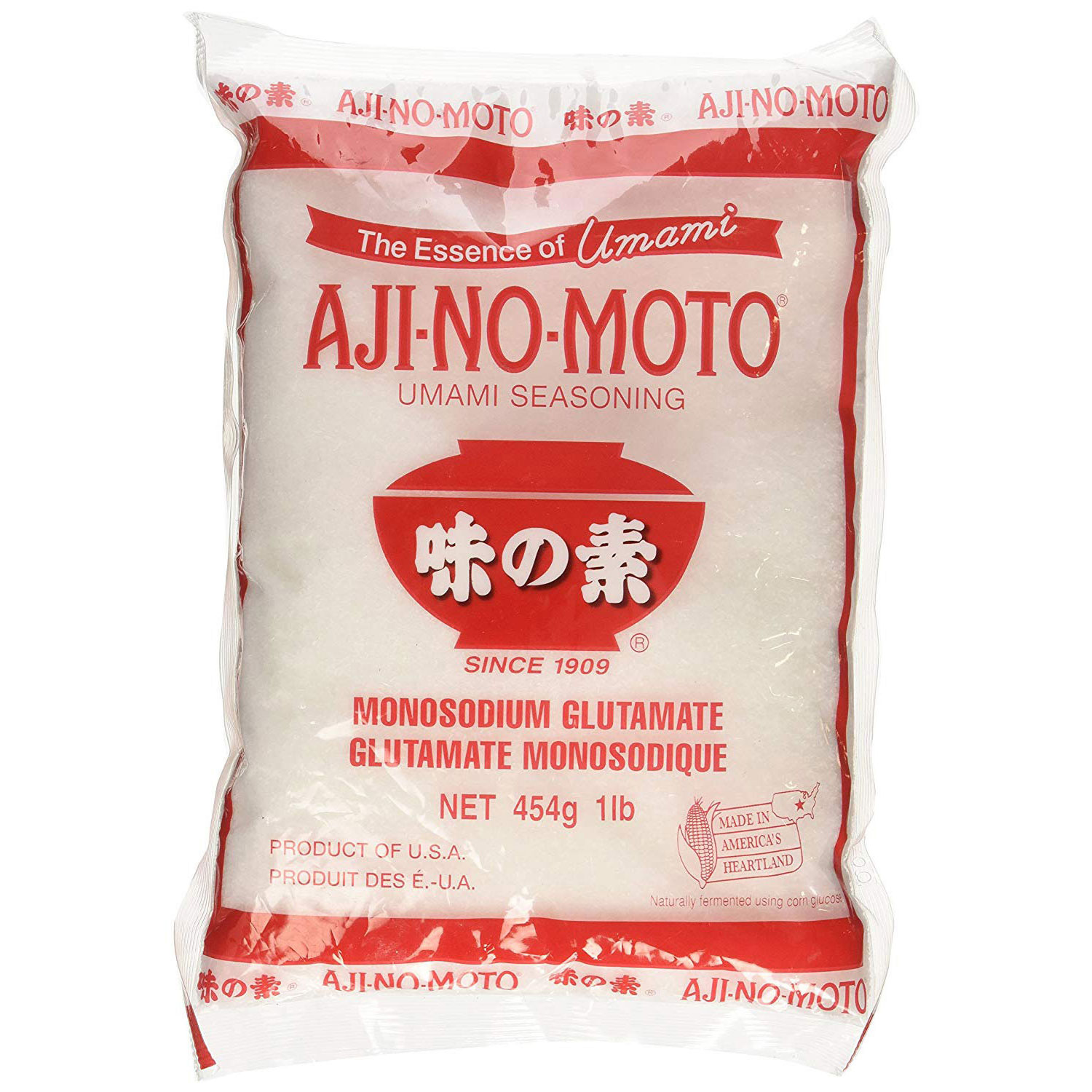
Ajinomoto’s business type primarily revolves around the production and marketing of food and seasonings, specifically targeting umami, one of the five fundamental tastes. Their flagship product, monosodium glutamate (MSG), revolutionized culinary practices by unlocking the depth of flavor in various dishes. Beyond MSG, the company diversifies its portfolio to include natural seasonings, frozen foods, and health products, thereby catering to a broad spectrum of consumer preferences and dietary needs. This strategic diversification reinforces the brand’s commitment to enhancing the dining experience, making Ajinomoto a versatile player in the food industry.
Historically, the Ajinomoto Company was founded in 1909 by Dr. Kikunae Ikeda, a professor of chemistry at Tokyo Imperial University. It was during his research on flavor compounds that he discovered the fifth taste, umami, which led to the creation of monosodium glutamate. The inception of Ajinomoto was not merely a business venture; it was a revolutionary concept that transformed the culinary landscape. As the years progressed, the brand expanded its reach internationally, solidifying its position as a leader in food technology and flavor enhancement.
The philosophy underpinning Ajinomoto is deeply rooted in the principle of sustainability and health. The company emphasizes responsible sourcing of raw materials and is committed to reducing the environmental impact of its production processes. Their mantra, “Eat Well, Live Well,” exemplifies a corporate ethos focused on promoting healthy lifestyle choices through nutritious and flavorful food options. This philosophy is not just a marketing strategy; it reflects a commitment to enhancing the quality of life for consumers globally.
In terms of design, the logo is nurtured by a collaborative effort between in-house designers and external agencies, showcasing a blend of traditional Japanese aesthetics with modern graphic design principles. This hybrid approach allows for the evolution of the brand identity while maintaining its core values and heritage. The resulting logo resonates with customers, creating an emotional connection that transcends mere branding. It is a reflection of meticulous craftsmanship, echoing the company’s dedication to quality and excellence.
Over the decades, the Ajinomoto logo has seen several iterations, but its core identity remains unchanged. The year of its inception aligns with the founding of the company in 1909, making the logo a century-old emblem that encapsulates over a hundred years of culinary innovation. Each version has been a testament to the evolving nature of design while staying true to the brand’s foundational principles.
In conclusion, the Ajinomoto logo is more than just a visual symbol; it embodies a rich history, a commitment to quality, and an unwavering dedication to enhancing the culinary experiences of consumers worldwide. Through thoughtful design and a robust philosophy, Ajinomoto continues to resonate with audiences, making each meal a celebration of flavor.